
Gap Wants to Be Seen. J.Crew Wants to Be Chosen

You don’t notice it at first.
Just a woman in a sundress. Wandering through a Buenos Aires street. Holding a bottle of soda, smiling like no one’s watching.
No logos. No celebs. No hook to go viral.
Just a still frame that makes you feel like you’ve been there before—even if you haven’t.
That’s J.Crew right now. Not loud. Not thirsty. Just...present. Like a favorite passage in a novel you underline but never post.
Meanwhile, Gap is doing backflips on the feed.
Parker Posey is in her “White Lotus era.” Dapper Dan is remixing Harlem heritage. Mette is dancing in slow-mo. Troye Sivan is gliding in soft denim.
Every post is a headline. Every collab a callback. Every moment engineered to be remembered again.
Both brands are chasing the same thing: to matter again.
But only one is asking quietly.
And in 2025, that might be the louder move.
II. Relevance Isn’t a Strategy. It’s a Feeling.
For most of fashion’s history, relevance was something you could calculate. You looked at trends, tracked silhouettes, watched the runways. You followed youth culture and adjusted your supply chain. If you moved fast enough, the customer followed.
But today, the center of gravity has shifted. Relevance isn’t a matter of pace or platform. It’s emotional. And the brands that endure are the ones that feel known—not simply seen.
That’s the backdrop to what’s happening at Gap and J.Crew right now. Both brands are rebuilding. Both have restructured. Both have adjusted their retail footprint, fixed their fits, and updated their creative leads. But those moves, while necessary, aren’t what’s making the difference.
What matters is the emotional temperature of their strategy.
Gap is asking you to remember.
J.Crew is asking you to reconnect.
They’re not selling the product—they’re selling the charge around it. The recognition. The familiarity. The trust.
And each brand is chasing that feeling in its own way.
Gap is returning to mass memory: the campaign images you used to tape to your wall, the hoodie your cousin wore to middle school, the fonts you know without needing a logo. Their strategy revolves around the idea that familiarity itself can be powerful—that if you recognize something quickly enough, you might feel something again.
J.Crew is moving more carefully. It isn’t chasing recognition. It’s rebuilding credibility. Not by offering a louder product or a stronger trend signal, but by creating a world that feels internally coherent. One that’s been styled with taste and edited with care. Where the clothes are quiet, but the atmosphere around them feels deliberate.
So while both brands are trying to matter again, they’re not doing it by adding more—they’re doing it by reestablishing what they stand for.
And if we zoom out, the emotional architecture of each approach comes into focus:
Gap is working through memory. J.Crew is working through meaning.
Gap is prioritizing reach. J.Crew is rebuilding resonance.
Gap wants presence. J.Crew is cultivating proximity.
These aren’t just marketing tactics—they’re emotional positions.
And they reveal everything about how each brand understands the culture it’s trying to reenter.
That distinction doesn’t just define their comeback. It defines the lens they’ve chosen to operate through.
And that lens is where the next part of this story begins.
III. Gap: The Franchise Reboot
There’s a distinct feeling to Gap’s current comeback attempt—and it’s not subtle. It doesn’t unfold slowly, and it doesn’t rely on close reading. It’s immediate, recognizable, and engineered for impact. A remix of familiarity, recoded through celebrity, nostalgia, and the soft gloss of IP.
This isn’t a rebrand. It’s a revival tour. And the setlist is loaded.
Barbie. Star Wars. Disney. Dapper Dan. Troy Sivan. Parker Posey.
Each name, each campaign, each capsule feels like it’s been selected not just for aesthetic fit—but for emotional association. Gap isn’t trying to build a new world. It’s trying to remind you that it used to be one.
That’s why the images feel cinematic. The videos choreographed. The references immediate. There’s no ambiguity. It’s all built to be understood at a glance—and to feel familiar even if you haven’t paid attention to the brand in years.
The tone isn’t subtle. It’s celebratory. Gap is in its “look who we got” era. From Troye’s dance troupe to Mette’s quiet viral run to Posey’s White Lotus-adjacent quirk, the casting isn’t just strategic—it’s symbolic. These aren’t fashion influencers. They’re cultural operators. People with reach and recognizability. The kind who signal moment without needing explanation.
And the campaigns themselves don’t rely on product detail or styling nuance. They rely on energy—shot compositions that feel more like trailers than ads. Music videos. Dance loops. Pop cultural immersion.
What ties it all together is the logic of IP.
Barbie, Disney, and Star Wars weren’t just licensing plays. They were emotional shortcuts. Each one taps into something already embedded in the collective memory. And Gap isn’t trying to reinterpret them—it’s simply placing itself next to them, hoping the association is enough.
This is branding as adjacency. Not identity, but alignment.
And that tells us something important:
Gap isn’t positioning itself as a tastemaker. It’s positioning itself as a cultural amplifier.
There’s a real intentionality in that. The brand knows it no longer defines cool—but it can still distribute it. It can serve as a platform for the feeling of the moment. It can borrow presence if it can’t build intimacy.
This strategy is not without precedent. We’ve seen it work for Crocs, for McDonald’s, for even Nike during its more performative stretches. The brand becomes a kind of cultural utility—omnipresent, collaborative, reactive. It may not have a strong point of view, but it has a flexible enough surface to project one.
The risk, of course, is that you become forgettable once the music fades. That without a defined identity, you’re always waiting for the next collaborator, the next nostalgia beat, the next big cultural moment to carry the charge.
But Gap seems okay with that—for now. Because for the first time in a long time, people are looking again.
And sometimes, in the middle of a retail identity crisis, being visible feels like enough.
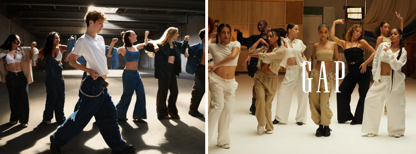
Images courtesy of GAP
IV. J.Crew: The Literary Arc
If Gap is trying to light up the feed, J.Crew is doing something quieter—almost the opposite. It’s not trying to insert itself into culture. It’s trying to build context for its presence. A brand that once dominated through editorial polish is now experimenting with how to be present in a way that feels personal again. Not urgent. Not viral. Just considered.
The shift isn’t loud, but it’s there. In the campaigns. In the casting. In the tone of the photography and the length of the pauses between drops. Where Gap’s world is saturated and kinetic, J.Crew’s is neutral-toned and spacious. A woman in a sundress walking through a city square. A moment at a flower stand. A coat left open just enough to imply something real is happening outside the frame.
This isn’t nostalgia. It’s proximity.
J.Crew isn’t trying to be remembered—it’s trying to be re-encountered.
And that comes through most clearly in the collaborators they choose. Not celebrities. Not media-trained influencers. People like Emily Sundberg—a writer, not a model. People like Emily Sundberg—a writer, not a model. Someone who built an audience not through appearances, but through intimacy. In a J.Crew x New Yorker campaign that barely registered as advertising, she sat in a classic NYC diner, wearing an oversized striped button-down and pleated skirt, sipping coffee and reading quietly. No performance. No posturing. Just a captured moment that felt like it could’ve happened without the camera there. The framing wasn’t aspirational. It was recognizable. Almost forgettable, in the most strategic way.
Then there’s the NYC Ballet campaign—styled like a coffee table book more than a brand rollout. It wasn’t pushing product. It was placing J.Crew in a context that felt cultural. Quiet grace. Discipline. Movement as metaphor. In a world of trends-as-theatre, this felt like an invitation to slow down.
The message isn’t “look at this.”
It’s “you already know what this is.”
You can trace the brand’s current energy across the same emotional spectrum as others playing a quieter game. Aime Leon Dore in its café-core mode. The Row, where silence is strategy. Even Lemaire, with its poetic functionality and soft authority. J.Crew isn’t mimicking these brands—but it’s moving in their direction. Toward stillness. Toward slower cycles. Toward a version of desirability that feels less performative, more lived-in. There’s also GANT, which recently tapped Albert Muzquiz—one of J.Crew’s own micro-icons—to lead their menswear lens. The same mood. The same codes. Just different expressions of taste-driven trust.
They’ve also leaned into low-key figures like Lizzy Hadfield, who exists in a kind of subcultural sweet spot: smart, stylish, distinctly analog. Her aesthetic—a bookstore, a trench coat, a knit sweater layered over meaning—feels like J.Crew without even trying.
And if there’s a campaign that captures this new energy most clearly, it’s their Spring 2024 series: The Art of Gathering. No celebrities. No influencers. Just a group of friends, real or cast to feel real, cooking, dancing, lounging. The clothes are light, textural, nearly invisible. The message is almost nonverbal: we’re still here, and we’ve remembered how to feel.
What’s emerging isn’t just a return to form—it’s a return to internal coherence. To a world where every casting choice, every fabric swatch, every campaign moodboard aligns with a central question: does this feel like us?
That question doesn’t create reach. But it builds something else: trust.
The kind of trust that can’t be manufactured through hype or spectacle. The kind that comes from restraint. From knowing what not to say.
And in 2025, when every brand is trying to yell above the noise, a whisper might be the most strategic tone of all.
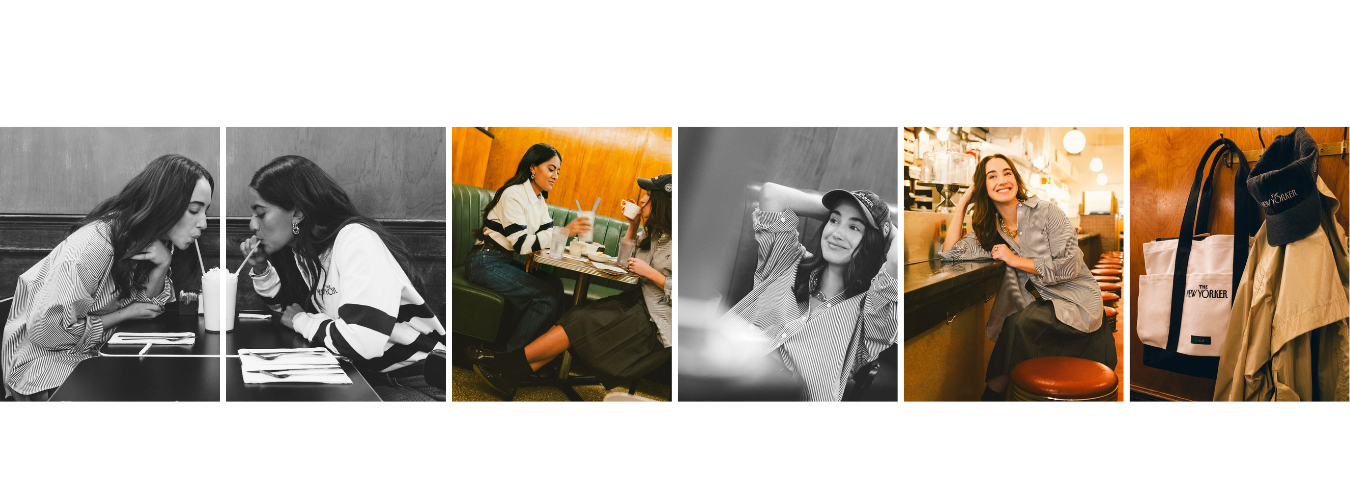
Images courtesy of J. Crew Instagram
V. Both Brands Are Tapping New York—But in Different Dialects
New York has always been more than a backdrop. For brands like Gap and J.Crew, it’s a kind of cultural shorthand—a place that can stand in for style, credibility, and identity all at once. But how you speak New York says everything about who you’re trying to reach.
Both brands are leaning into the city right now. But they’re not speaking the same language.
Gap’s New York feels cinematic. Fast-paced. Designed to be watched. Their world is lit like a soundstage, populated by performers and creatives—people with presence. In one campaign, a full dance troupe hits synchronized movements in a concrete garage. In another, models pose mid-stride in front of warehouses, bathed in studio lighting. The city isn’t lived in—it’s stylized. It’s the set. You’re not in the city, you’re in a performance of the city.
Everything is in motion. Everything is dialed up. Even their stills feel like they’re waiting for a soundtrack to drop.
The feeling is familiar—like watching a trailer for a show you remember loving. You might not recall the plot, but the mood hits instantly. There’s energy. There’s rhythm. There’s craft. But there’s also distance.
J.Crew’s New York, by contrast, feels slow and specific. It’s not trying to show you the city. It’s letting you sit inside it. The camera lingers on quiet sidewalks. Coffee shops. Bookstores. A woman biking past a jacaranda tree. There’s no overt styling. The light is natural. The clothes don’t pop—they settle into the frame.
You don’t feel like you’re watching a campaign. You feel like you’re observing someone’s afternoon.
This isn’t the New York of momentum. It’s the New York of rhythm. Of small rituals. Of the kind of personal routine that only makes sense if you’ve lived here a while.
And that’s the difference.
Gap is drawing from New York’s cultural energy. J.Crew is drawing from its emotional texture.
Both are trying to rebuild relevance through place—but place means different things when your goal is reach versus resonance. For Gap, the city is a source of performance and pulse. For J.Crew, it’s a source of intimacy.
And in an era where brand identity is often tethered to setting, these spatial choices matter.
Because when a customer scrolls past a Gap ad, they’re meant to think, “I remember this.”
When they pause on a J.Crew image, they’re meant to feel, “I live like this.”
VII. Aesthetic Counterparts – Who They’re Mirroring (and Why It Matters)
No brand exists in a vacuum. Especially not in a moment like this—where cultural value is as much about reference as originality. When a brand rebuilds, consciously or not, it starts to reflect others in its orbit. Not to copy, but to signal where it sees itself in the hierarchy of taste.
Gap, right now, mirrors a very specific type of brand energy.
The kind that thrives on saturation. Ubiquity. Cultural shorthand.
Think Nike, during its more nostalgic runs—where emotion came preloaded through a Jordan silhouette or an Air Force 1 remix.
Think Crocs, turning from meme into mass movement through pure repetition and unexpected collaborations.
Even McDonald’s, with its ability to partner with anyone from Travis Scott to Cactus Plant Flea Market—not because it’s cool, but because it doesn’t need to be. The cool comes from adjacency.
That’s the lane Gap is operating in: brand as platform.
It doesn’t have to deliver a singular aesthetic. It just needs to be recognizable, remixable, and always within reach.
This isn’t about fashion as authority. It’s about fashion as fluency.
Being in the conversation is the win.
In contrast, J.Crew is moving with brands that prioritize clarity over reach.
Not scale, but system. Not trend, but tone.
It’s not just about The Row’s silence or ALD’s café-lit polish. It’s about a kind of emotional depth that lives below the surface. These brands don’t depend on celebrity. They don’t move product through hype. They build presence slowly—through consistency, atmosphere, and editorial precision.
You also see J.Crew’s adjacency in more subtle moves—like GANT’s pivot into curated storytelling and thoughtful casting. Brands that don’t need you to pay attention. They just need to exist in the right person’s periphery.
This doesn’t mean J.Crew is chasing minimalism. It means it’s choosing focus.
An aesthetic that says: we’re not trying to be first—we’re trying to be right.
Both of these reference maps are strategic.
One is built on speed and association.
The other is built on restraint and rhythm.
Neither is better, but they reveal the core truth behind each brand’s positioning:
Gap is trying to be part of everything. J.Crew is trying to belong somewhere.
VIII. What It Feels Like Now – The Quiet, the Loud, and the In-Between
Spend enough time around these brands—scrolling their feeds, walking into their stores, noticing how their clothes show up in the world—and a rhythm emerges. One that isn’t about what they’re doing, but how those decisions feel when you encounter them.
Gap feels like a performance.
There’s choreography to it. Movement. Posture.
You’re supposed to catch it mid-scroll, mid-stream, mid-trend—and feel something immediate. A flash of recognition. A fragment of memory. That hoodie you wore in high school. That font you’ve known since childhood. That model you saw in a campaign two weeks ago—now dancing across your feed, or talking to a camera, or holding the newest capsule like it just arrived from another franchise drop.
There’s a kind of electricity in it.
But it’s short. It doesn’t linger.
You don’t stay with Gap—you bounce off it, onto the next moment.
J.Crew feels like an echo.
It lands slower. It doesn’t demand your attention right away.
Sometimes, it doesn’t even register as marketing. Just a photo of someone you’d like to know. A mood you want to be closer to. A sweater you didn’t realize you were missing.
There’s a softness to it. Not in the styling, but in the pacing.
You’re not being told a story. You’re being let in on one—gently, without pressure.
Where Gap wants to be noticed, J.Crew wants to be remembered later—when you’re looking for something that feels like you.
Not a headline. A presence.
And what’s interesting is that both strategies work—but in entirely different ways.
One fills space.
The other builds it.
One aims for recognition.
The other leans into resonance.
And the result is a cultural split—not just in how these brands market, but in how they’re received. One catches you in a moment. The other meets you in a mood.
IX. Closing – What This Teaches Us About Brands That Survive
When we talk about brand revivals, the conversation usually orbits around numbers—store count, margin recovery, marketing spend. But those are outcomes. The real shift happens earlier, and more quietly: in how a brand chooses to be felt again.
That’s what makes the Gap and J.Crew comparison so revealing.
They aren’t just two legacy names trying to find relevance again.
They’re two case studies in what survival actually looks like—one betting on volume of memory, the other on precision of meaning.
Gap is leaning into recognition—using nostalgia, celebrity, and cultural IP to remind you it was once central. It doesn’t ask for commitment. Just a second glance. A moment of recall.
It’s playing the short game, but playing it well. In a feed-based economy, visibility is still currency.
J.Crew, on the other hand, is taking the longer way around. It isn’t rushing to be loved. It’s trying to be trusted again. That means better choices, fewer drops, clearer tone. Not chasing attention—but creating something worth returning to.
Not asking to be remembered—but earning it through rhythm.
Neither brand is where it wants to be yet.
But both have stopped trying to be something they’re not.
And maybe that’s the first step in a real comeback—not louder marketing or bigger influencers, but a willingness to define what kind of relevance actually fits.
Because in a culture where attention is constant and meaning is rare, the brands that last aren’t always the ones with the most reach.
They’re the ones that know exactly what they’re trying to say—and who they’re saying it for.